In two earlier articles on Power BI I showed how to connect to Google Analytics and how to create an ArcGIS Map visualization. I have now gone through the course Analyzing and Visualizing Data with Power BI, and will give you access to some of the interactive reports that I have built.
Data Review
The data that I used was obtained from the Commission on Revenue Allocation (CRA)’s Integrated Devolution Data Portal. I used the same data in 3 Excellent Visualizations for Your Excel Data, but for this project the data was transformed, modelled, and visualized in Power BI Desktop and shared as embedded code in Power BI Service.
Let’s start with a brief assessment of the CRA data.
- Accessibility – The CRA data can viewed online in the data portal as a series of interactive reports. Each report can be sliced by year and county and shared as a link, on social media or embedded in a website. The entire dataset can also be downloaded as a Tableau Workbook, while the visualizations can be saved as a PDF document or an image file. The Tableau Workbook can be converted to CSV or Excel with Tableau Public, a free software.
- Accuracy – One assumes that data published by the Government is accurate, but there are discrepancies between the data portal and its data source “The County Allocation of Revenue Act, 2017”. Most notably, loans and grants from development partners for 2016/17 are excluded from the conditional grants figures in the online data portal. Such a gross omission casts doubts about the accuracy and validity of the entire dataset.
- Currency – The portal appears to use population data from the 2009 census to calculate per capita figures and it is well possible that they use 2009 population data in their revenue allocation formula. It’s evident that population in 2017 has grown considerable and some counties will have grown faster than others.
- Completeness – The conditional allocations to the counties for 2017/18 were gazetted in “The County Allocation of Revenue Act, 2017”, but don’t appear in the data portal. Own source revenue data for 2016/17 and 2017/18 are also missing and in the absence of audited accounts, the portal could have used a budget estimates.
- Relevance – The CRA is extremely relevant since the equitable sharing of revenue between the national and country governments is enshrined in Kenya’s new constitution. Indeed, the data portal enhances transparency by disclosing revenue allocation to the different counties. Yet, disclosure of the data sources and the factor values used in the allocation formula could have made the portal more relevant.
The CRA data were complemented with population data from the 2009 National Population and Housing Census and projections derived from the County Statistical Abstracts published by the Kenya National Bureau of Statistics (KNBS). The population data was reviewed in Unlocking Kenya’s 2009 Census Data.
Data Preparation
As in a typical data science project, data transformation and data modelling proceeded the data visualization. Here is a summary of the key steps.
- After downloading and converting the Tableau Workbook to CSV, the data was converted to an Excel Workbook. Each of the variables was stored in a separate spreadsheet to mimic a scenario where data comes from disparate sources or is kept in different silos.
- The data was then imported into Power BI Desktop and several steps where applied in the Query Editor to get the data in the required structure and format.
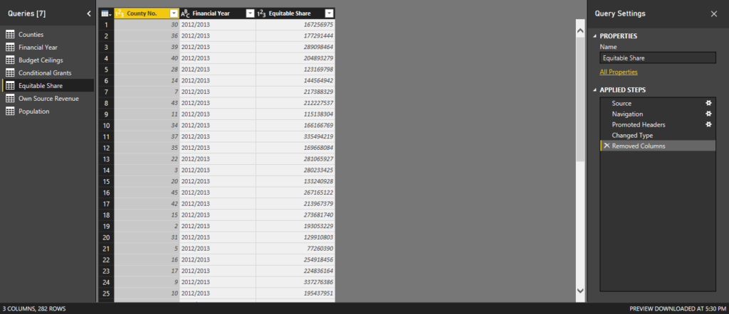
- Two link tables financial year with 6 financial years from 2012/12 until 2017/18 and counties with the 47 counties where then created to ensure that all tables are related by financial year and county.
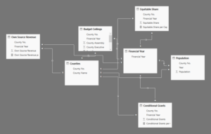
- Measures are calculations on your data that can be sliced and diced like other variables. In this project the measure Total Revenue was calculated as the sum of equitable share, conditional grants, and own source revenue. Per Capita measures were then calculated for each revenue component by dividing the county totals with the county population. To give you a better idea, here’s the formula that calculates for the Total Revenue per Capita measure.
![]()
Data Visualization
Reports can be created in Power BI Desktop or the Power BI Service, and the report editor works just the same. However, a Power BI Desktop file can only have one report (with multiple pages), but within Power BI Service there’s no restriction on the number of reports.
To embed one-page reports into this article, a multiple page report was created in Power BI Desktop and published to Power BI Service. In Power BI Service I generated the embed code for several pages of this report for use in this blog post. You can now enjoy the full experience of interacting with these reports, so let’s take the opportunity to review a handful of them.
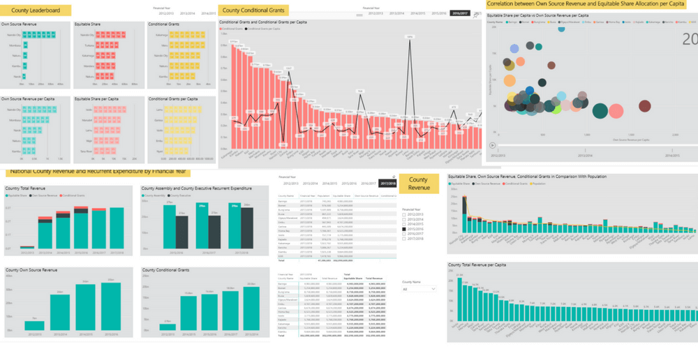
The first report provides a national summary on total county revenue and recurrent expenditure. It shows a steady increase in allocated and earned revenue over time and control over recurrent expenditure. The stacked and clustered column chart visuals used in this report are well-suited for summary statistics. The interactivity of this report is limited, but data values display on hover and you can filter the data in all the visuals by clicking on any of the bars.
The next report provides an overview of revenue by county. The top visual shows the contribution of equitable share, own source revenue and conditional grants to the total revenue. Notice that the bottom visual which shows total revenue per capita has a different order. The top visual uses a line and stacked column chart to enable a comparison between total revenue and population. There appears to be a strong correlation, but a few counties appear as outliers due to their large size.
The interactivity of this report has been increased with two slicers. The time slicer shows the different financial years and allows you to look at all the data or the data for a given year or years. The county slicer allows you to filter the data by counties of interest. Notice also that the time and county slicers are configured as a checklist and drop-down list respectively.
The above report shows the different revenue streams for the different counties with a comparison between the total and per capita figures. It uses the line and stocked column chart as the visual with the addition of a time slicer and a slicer for the different revenue streams. The data points are labeled and the slicers are configured horizontally to maximize on real estate. This report is very dynamic since it allows you to switch between different measures and automatically updates the title.
Scatter charts are an excellent visual for discovering relationships and correlations within your data. In the report above equitable share per capita has been plotted against own source revenue per capita. In this case, the scatter chart doesn’t show a strong correlation between the two variables, but indicates that counties can be clustered according to their levels of equitable share and own source revenue per capita. The interactivity in this scatter charts consists of a play button that shows the relationship between the two measures over time. Click on a bubble and you will be able to trace its movement over time.
This final report uses the Infographic Designer custom visual, which was downloaded from Microsoft AppSource. The report shows the 5 top counties for 8 different measures and uses a time slicer that can filter the data by financial year. The custom visual has replaced the bar chart symbology with a set of icon symbols. In this example I used a dollar note icon to represent revenue figures.
Wrapping Up
Power BI Desktop is a powerful tool for data transformation and data modeling and can connect to a wide variety of data sources both on-premise and online. Power BI incorporates a report editor with a wide range of visuals that allow you to create beautiful visualizations and reports.
Power BI reports that are published to Power BI Service can be incorporated in dashboards and shared with interested parties. One powerful way of sharing Power BI reports is publishing them to the web as embed code that can be added to public web pages.
Reports that are published in this manner are dynamic, so on refresh they will update when the underlying data changes. The reports are also interactive giving the user the opportunity to interact with the data for deeper insights.
Over to you, have are you sharing reports with your shareholders? Doesn’t dynamic and interactive reporting online sound like the solution you’ve always wanted? Let’s hear from you.